What goes into a great B2B logo design?
‘It’s never just a logo,” says a B2B branding and design expert who describes the logo creation process
As a branding element, logos are small in stature, but they do a lot of hard work for your brand.
At its core, logo design is about unity — the connections between your brand, your values and goals, and your customers’ perception of the services you offer. It should speak to your brand at any scale, in any setting or format.
That’s the art of logo design for Jeanette Thompson, Marketing and Brand Strategist at Motum B2B. Whether it’s a new logo or a redesign, it’s all about marrying a plethora of information about your brand with modern design principles.
The journey starts with a conversation about your objectives.
You want to create something memorable and meaningful that ties back to the audience you’re trying to resonate with. Jeanette Thompson, Marketing and Brand Strategist at Motum B2B
1) Start with the “why”
The first step is understanding why you want a new logo. Sometimes it’s simple: you’re a brand-new company, and you need something to represent your vision.
“For a brand-new logo, you would go through a strategic exercise to understand who you are as a company, what your values are, and what your brand persona should be,” says Thompson. “It’s understanding the whole tone and positioning you want for your company.”
What about existing companies?
More frequently in B2B, we’ll see a company with an existing logo. They may have been players in their industry for a long time, but there’s usually a key reason why they are considering a redesign.
“It could be that the logo doesn’t work anymore in the marketing space, or that it no longer aligns with the overall corporate vision,” Thompson explains, adding that the “why” will be important in shaping the new-and-improved logo.
Whatever the case, each company has very specific, unique aspects of their brand and a personality they want to present. Many of these features will be channeled into the actual design components of your logo.
2) Understand your brand
Whether you are starting a new company or redesigning an existing logo, a designer’s first step will be a listening exercise to understand the different aspects of your brand.
“If you don’t do the base exercise to establish who the brand is, you’re throwing things against a wall ‘til it sticks,” Thompson says. “You want to create something memorable and meaningful that ties back to the audience you’re trying to resonate with.”
What are branding exercises?
These sessions might involve exercises to define your brand’s archetype, buyer personas, and core mission, vision, and values, to name a few. Throughout the exercises, keep in mind that your audience may have a different perception of your brand.
“Your brand is the wrapper that encompasses everything about what people think about your company – it's not what you think about your brand,” Thompson explains.
3) Consider colour
Takeaways from the exercises will come across in the logo’s colour palette. For instance, you can shape the brand archetype using a colour that evokes similar emotions. A bold, ambitious brand may use red in their palette, while thoughtful brands can evoke peace of mind with a calming blue.
Can you use multiple colours?
It may be tempting to use a whole rainbow of colours in the logo’s scheme – especially if you have, for example, a suite of products with their own sub-logos. But Thompson advises you to think about how that brand palette works together as a cohesive unit.
“If you have too many colours in too many spaces, you start to lose brand alignment. Again, we need to think about the final goal of determining where we are and where we want the logos to be used.”
“Usually, I start with deciding on what the core colour should be. If we’re coming from an existing colour, can we enrich it a little bit?” Thompson says. “You’ll need to consider colour in the digital space, to ensure you get things like CTAs bright enough to grab a viewer’s attention.”
What about colour accessibility?
In addition to making sure your logo’s colour scheme meets the brand framework, it’s important to consider accessibility. It’s about making sure audiences of all stripes can view the colours comfortably in any format – whether it’s showing up on a website, a print brochure, a billboard, or a 4K television.
“I’m always thinking about how designs will display in the broader brand spectrum,” Thompson adds.
4) Shape the logo
In terms of shape and composition, modern logos are trending towards more of a streamlined look. You can look at the evolution of big brand logos and see what we mean. Thompson believes the right shape can set your logo apart from other brands.
“So, when I’m thinking about shapes and elements for a particular brand, I’ll look around to see what other shapes are commonly used in that industry,” Thompson explains.
How does shape affect the logo's look?
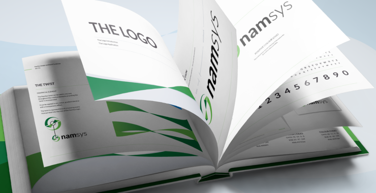
The shape can give your logo distinction while evoking the core elements of your brand. For example, we recently redesigned a logo for a maker of industrial magnets. The new design has strong lines and a bold colour scheme to represent the reliable, durable nature of their products.
We also redesigned a cash flow software company’s logo with a “twist” to represent the exchange of currency within an ecosystem – you can read about it by clicking the project link below.
5) Iterate, revise, and set guidelines
A single logo can go through several iterations before we land on the right one. After research and concepts, Thompson’s approach is to create a set of strategic options and get feedback from key stakeholders. Then it’s all about revising and refining.
“Typically, the initial versions of the logo are a knee-jerk response. So, you always want to go beyond that surface reaction and find deeper meaning in the next iteration.”
Thompson then goes back to considering the logo’s relationship to other elements – what fonts it goes well with, where it will be used and displayed, and all the colour and shape considerations we mentioned earlier.
“Then it’s about weaving in that final element that will help connect the dots to make the logo memorable,” she says.
How do you implement a logo correctly?
Eventually, you get an impactful logo. Congrats! Because of the logo’s interconnectedness with all those other brand elements, the next crucial step is to create a set of guidelines about how they should – and should not – be used. Brand guidelines outline important rules like whether the logo can be reshaped or resized, treatments to avoid (such as outlines or drop shadows), and what colour combinations are acceptable.
This ensures the logo and all its accompanying elements stay unified with your brand, no matter where or how you use them. You can also send guidelines to help partners or agencies use your logo correctly.
A small visual can pack a big punch
A logo may seem like a small thing, but it speaks volumes about your brand. Logo design is a journey that can open a whole world of possibilities, and implementing it through all the different touchpoints of a B2B marketing campaign is what makes it successful in the end.
“It’s never just a logo,” says Thompson. “It’s really all about the brand.”